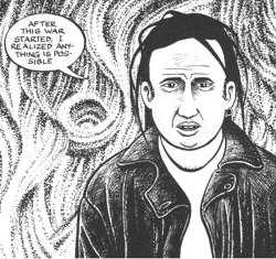
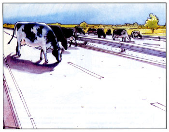
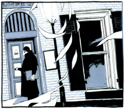
The Twentieth Century According to Willem
Most of Bernard Holtrop’s fame is due to the thousands of satirical images he fired away at the newspaper audience for the last twenty years under the pen name Willem. Less known are the wordless comix he based on press photos, published in 30/40 and Euromania. Two haunting works, in which Willem redefines what comix can be. Why does someone choose to redraw hundreds of old newspaper photographs?
The introduction to 30/40 offers the beginning of an answer. It brings us back to the first years after the Second World War, the moment when the Ermelo, the Netherlands, based Holtrop family finds Life Magazine in the mail. A weekly visiting-card from the at that time in the Netherlands still most mysterious ‘liberator country’ USA. Life’s famous photoreportages stun the Ermelo school boy (born in 1941). Like most of his Dutch contemporaries he hardly understands a word of the English captions. Thus Life’s images express a mysterious visual power that will stay with Willem for the rest of his life. Willem’s memory of the images – and the countless news photographs that succeeded them – is so strong that, in his forties, the artist takes them as the basis for his own art.

Unconventional
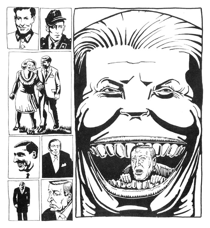
It is virtually impossible to compare Willem’s drawn photocomix with other books. Both 30/40 and Euromania are structured according to title pages which dryly state setting and theme. For instance, in Euromania: ‘Belgium – Tragic Kings, Broken-down Africa, United Couple, Devided People, Left-wing Terror, Right-wing Murder.’ After that, only Willem’s images speak. Thus, on the second page devoted to Belgium, he visualizes Belgium’s colonial past with portraits of King Boudewijn, President Mbutu, a group of nuns and UN soldiers. The pages bear a striking resemblance to conventional comix: several pictures on a page, all resolutely framed, in sequence. In short, the familiar comix page grid. Familiar as it may look, Willem’s way of employing the comix grid is highly unconventional. In 30/40 and Euromania the conventional reading direction from left to right and from top to bottom is not necessarily to be followed, while the development of anything resembling a story (with identifiable characters and a plot) is also far away. A second look makes very clear that the strict demarcation of the images does not deliver what it promises. Though the form of 30/40 and Euromania may instantly appeal to a comix reading audience, it does not get what it expects. The readers are left to figuring it out themselves.
Small type
For a better understanding of Willem’s drawn books of photographs it is best to return to the Dutch boy who, in the late nineteen-forties, marvels at Life Magazine’s photographs. They offer him an image of unknown locales, a window on the world that gets extra colour because of the incomprehensibility of the captions below them. Because Life’s images have to speak for themselves, the young artist’s imagination can take maximal liberties. A telling example from Euromania: what does the image of the marching young men with ‘UN’ on their helmets mean, taken by itself, without any caption or photo credit? Seeing the news image this way, straight from the dark room as it were, makes for a hard time interpreting it, just like the young Willem hardly had any clues to make sense of them. It is proof of the big importance of the small type below press photographs, which describes what is to be seen in the image. These captions exemplify the journalistic striving for factuality: the who, what, where and why from the journalist textbooks. According to this logic, the marching men with ‘UN’ on their helmets are no participants at a curious sort of carnival nor nervous youngsters on their way to an earnest male initiation ritual, but the members of an international armed force out on a specific mission on a specific date. In this context, hundreds of thousands of people lay their eyes on them and the pictures enter the collective subconscious. Willem is no exception. Similarly, the media informed him about the Kennedy assasination, the buddhist monk’s protest suicide, the Falklands war and many, many other news facts. With the artist, however, the images did not disappear somewhere to the back of his memory, but after some time they popped up back on paper again. Without caption nor photo credit, and consequently just as mysterious as the Life pictures the artist as a young boy had watched some three decades before.
Contrast
The absence of any verbal context makes for a remarkable contrast with the familiarity the images bring about. After all, we have seen most of them before. The question is raised, what was the images’s context? Willem offers only indirect clues, by putting the images next to other images that appearantly pertain to the same theme. For the rest, the readers are left to their own memories. And when these fail – this happens more often than one would expect – only the imagination offers relief. This way, many pictures in 30/40 and Euromania spill over into each other like images in a dream: the images look familiar, but their respective relations jump from one association to another. Willem’s images remain instable. Thus, they open up a panorama of fresh meanings.
Associations
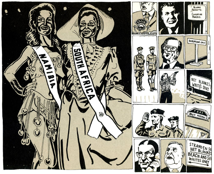
But it is not only the unknown origin and meaning of the news images that make for the visual power of Willem’s drawn photobooks. If that would be the case, then Willem could have sufficed collaging the original photographs. Instead, he takes one more step. Not only does Willem put the news images in a new context, but he also chooses to redraw all of them. A most laborious choice. As much as the artist may have come to this choice by intuition – if we are to believe the introduction to the anthology Deadlines, the man is drawing virtually anything that comes before his eyes – it is far from neutral. By redrawing the photographs, Willem appropriates them. The images transform from well-known news facts to parts of his visual vocabulary. Willem’s idiosyncratic style inevitable makes for associations with the rest of his works. That is why his rendering of the white Miss Namibia and Miss South-Africa looks significantly different than on camera, or when another artist, say Will Eisner or William Vance, would have drawn it. Willem’s style directly relates them to the rest of his works, an oeuvre not exactly known for its subtlety – as is abundantly to be seen in Deadlines – but all the more for its sardonic feel for humour and not overly optimistic view of humanity. Willem’s ‘line’ inevitably reminds one of plastically rendered sexual organs and grotesque physical mutilations. This redefines his news images, as neutral and recognizable they may seem at first sight, and gives them a distinctively dark, brooding quality. Nothing human is unfamiliar to Miss Namibia and Miss South-Africa, such is made very clear by Willem’s 30/40 drawing of them. Behind the shine of their winner banners, feelings of superiority, sexual frustration, hunger for power and other all too human qualities galore. In Euromania these associations are even more obvious, since in this book Willem not only redraws the news images, but also constructs his page layouts around one central, very articulate satirical image. Here, the signature of the merciless visual commentator Willem is not to be thought away at all.
Question marks
Aside from Willem’s effective way of reworking the news images, it is also their historical value that makes 30/40 and Euromania most impressive books. For, like no other time, the twentieth century has been recorded by humanity. Both the scale of this and the – literally – photographic precision with which modern history has been recorded are without precedent. In many ways the camera can be seen as the symbol of modern times, as cultural philosopher Scott McQuire convincingly argues in his Visions of Modernity. Twentieth century history is virtually unthinkable without the photographic images that both recorded it and helped it come about. This is an idea that resonates in the introduction to 30/40. Besides the Life photographs of his youth, Willem writes about ‘images which have been reproduced so many times that we cannot ever put them out of our minds’. Like all modern human beings, Willem finds himself confronted with a heritage of news images. A heritage which is growing incessantly, since the images follow each other with increasing speed. Whenever possible, events are recorded before they have actually ended. ‘Being there’ live is the defining slogan of the camera age. The logical outcome of this development is called CNN: ready 24 hours a day to record reality. Willem is distrustful of this relentless flood of news images. They pass too quickly for his liking. That is why he takes one step back in his drawn books of photographs to look back on yesterday’s news, more specifically the visual heritage of the second part of the twentieth century. What do these news images tell us when they are liberated from their trusted journalist corsage of factuality? What kinds of stories do they suggest us then? Do they centre on all those impressive buildings, those proud uniforms, those earnest rituals? Or on the ideas for which these stand for? Or is the truth rather to be found in the forms the clouds uniformly take after any bombardment, as is suggested by the cover papers of 30/40?

All of these are impressive question marks pertaining to a time of unprecedented turbulence. Willem puts them on paper using the photographic news images that define our media age to the core. What is their real attraction, he insists. Are we honestly expecting that they will ever show us anything other than yesterday’s news?
Toon Dohmen
Published in the late Dutch comix magazine ZozoLala, ‘Taking comix very, very seriously since 1982’, no. 107 (2000)
Sources:
Willem: 30/40 (Futuropolis, 1987)
Willem: Euromania (Futuropolis/De Harmonie, 1992)
Willem: Deadlines. Des 60’s aux 90’s (Ed. J-P. Faur, 1998)
Scott McQuire: Visions of Modernity. Representation, Memory, Time and Space in the Age of the Camera (Sage Publications, 1998)
Enjoy this text? Then you might also want to read:

